


 Register
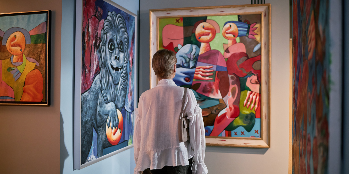
When discussing contemporary art, attention often focuses on the artwork itself: the artist’s gesture, the composition, the materials, the message. Yet there is an element that can radically transform the perception of a piece: the frame.
It is not merely a support or a container, but a true aesthetic and conceptual tool that interacts with the work, enhances it, and amplifies its visual impact.
The Frame as a Bridge Between Artwork and Space
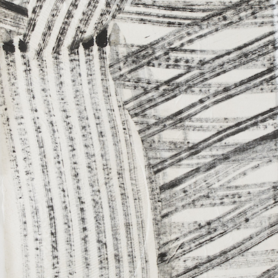
In contemporary art, the work often moves beyond the traditional canvas or conventional support: it may be an installation, a print, a photograph, a collage, or an intervention on unconventional materials.
In this context, the frame acts as a visual bridge between the piece and the surrounding space, creating a threshold that guides the viewer’s gaze. A thoughtful choice of material, color, and shape can emphasize:
- the contrast between surface and support
- the depth of the image
- harmony with the environment in which the work is displayed
For example, for street art pieces, a minimalist frame in natural wood or satin metal allows attention to remain focused on the artist’s gesture without distraction, while more elaborate frames can engage with the theatrical and iconic aspects of the work.
Materials and Finishes: The Frame as an Extension of the Artwork
The material of the frame is not only aesthetic, but contributes to the overall meaning of the work. Some typical examples:
- Natural wood: ideal for works that evoke warmth, craftsmanship, and tactility. Perfect for collages, mixed media, and screen prints on paper.
- Metal: modern and linear, it emphasizes contemporaneity, clarity of gesture, and minimalism. Often chosen for photographs, screen prints, and graphic works.
- Floating frames: create a sense of lightness and visually detach the artwork from the wall, enhancing its three-dimensionality and depth.
Every choice must engage in dialogue with the artwork: the frame becomes an integral part of the visual language, transforming from a simple container into a narrative tool.
Color and Proportions: Visual Balance
The color of the frame should never compete with the artwork. Neutral tones — white, black, gray, light wood — are versatile and allow the image to emerge, while bolder colors can highlight specific elements of the composition.
Proportions also matter: a frame that is too thick can “suffocate” a small work, while one that is too thin risks making it appear incomplete. The balance between the size of the support, the presence of the frame, and the surrounding space is essential to fully enhance the piece.
The Frame as a Curatorial Choice
In contemporary collecting, the frame is never a secondary detail. Galleries such as Wunderkammern accompany artworks with solutions that respect the artist’s aesthetic research and the audience’s perception of the work.
A well-designed frame:
- increases the perceived value of the artwork
- protects its materials and ensures proper conservation
- transforms the viewing experience into a complete aesthetic moment
In the case of street artists, contemporary illustrators, and visual creatives, the frame becomes a means of translating an urban or pop language into a domestic or museum context, without losing its immediacy and original visual impact.
The frame is much more than an accessory: it is a partner to the artwork, an element capable of amplifying its expressive strength and guiding the viewer’s gaze. In the context of contemporary collecting, choosing the right frame means respecting the artist’s intention and enhancing the aesthetic and cultural investment.
In other words: a good frame doesn’t simply frame the artwork… it makes it shine.